A few years ago, I was working with a startup that had just launched their website. We were proud of it — it looked clean, had great product shots, and ticked all the branding boxes. But after the first month, we realized something was off: barely any leads were coming in. Traffic was decent, but conversions were almost nonexistent.
After digging in, I realized we were making it hard for people to take action. There was no clear call-to-action (CTA), no form above the fold, and definitely no follow-up once someone showed interest. We were so focused on how the site looked that we forgot what we actually needed it to do.
That experience taught me something big: a beautiful website isn’t necessarily a lead-generating one. But with a few thoughtful tweaks, you can optimize your website and turn passive traffic into a steady stream of engaged leads.
Whether you’re starting from scratch or just need a few quick wins, there are simple things you can do today to make your website work harder for your business.
Let’s break it down step by step and go over some lead generation website best practices.
Table of Contents
How to Create a Lead Generation Website
Before jumping into how to optimize your website for leads, it’s important to understand how the lead generation process actually works.
What turns a casual website visitor into a lead?
The process typically follows these steps:
- A visitor clicks on a CTA on your website — this could be anywhere, including a blog post, your homepage, or a product page.
- That CTA takes them to a dedicated landing page where they’ll see some kind of offer (like an ebook, free trial, webinar registration, etc.) and a form to leave their contact details.
- Once they submit the form, they’re taken to a “Thank You” page, where they’ll either get access to the offer or confirmation that it’s on the way. (We’ll talk more about this later).
Each of these steps plays an important part in turning visitors into leads, and optimizing them can make all the difference. Let’s take a closer look at each step, and I’ll show you a few simple tweaks you can make to start generating more leads today.
1. Start with a clear goal.
Every great lead generation website starts with a purpose. Sure, the end goal is to get more leads, but if you don’t know exactly what you want those leads to do, your strategy can feel all over the place.
I learned this the hard way. As I mentioned above, I worked on a website that had all the right elements, but we were trying to do too much at once. We were pushing free trials, offering downloadable guides, and trying to book demos — all at the same time. To fix it, we took a step back and clearly defined our primary goal.
Here’s what we changed: Instead of trying to capture every type of lead, we focused on one main action per page.
Free trial pages were optimized for sign-ups, while blog posts directed visitors toward relevant content offers. Once we did that, our conversion rates improved almost overnight.
So before rushing to set up your own lead generation website, I want you to dig deeper and think about what it is you actually want to accomplish.
- Want to educate your audience? Offer a free ebook, guide, or any type of downloadable content that provides value in exchange for their contact information.
- Hoping to increase product sign-ups? Make sure your landing pages and sign-up forms are simple, clear, and have strong CTAs.
- Looking to book more demos or consultations? Use an easy scheduling tool that removes friction and gets people on your calendar faster.
Once you nail down your goal, everything on your website — from the CTA buttons to the landing pages — should guide visitors toward that action.
The clearer your goal, the easier it is to create a site that actually converts.
2. Choose the right CMS.
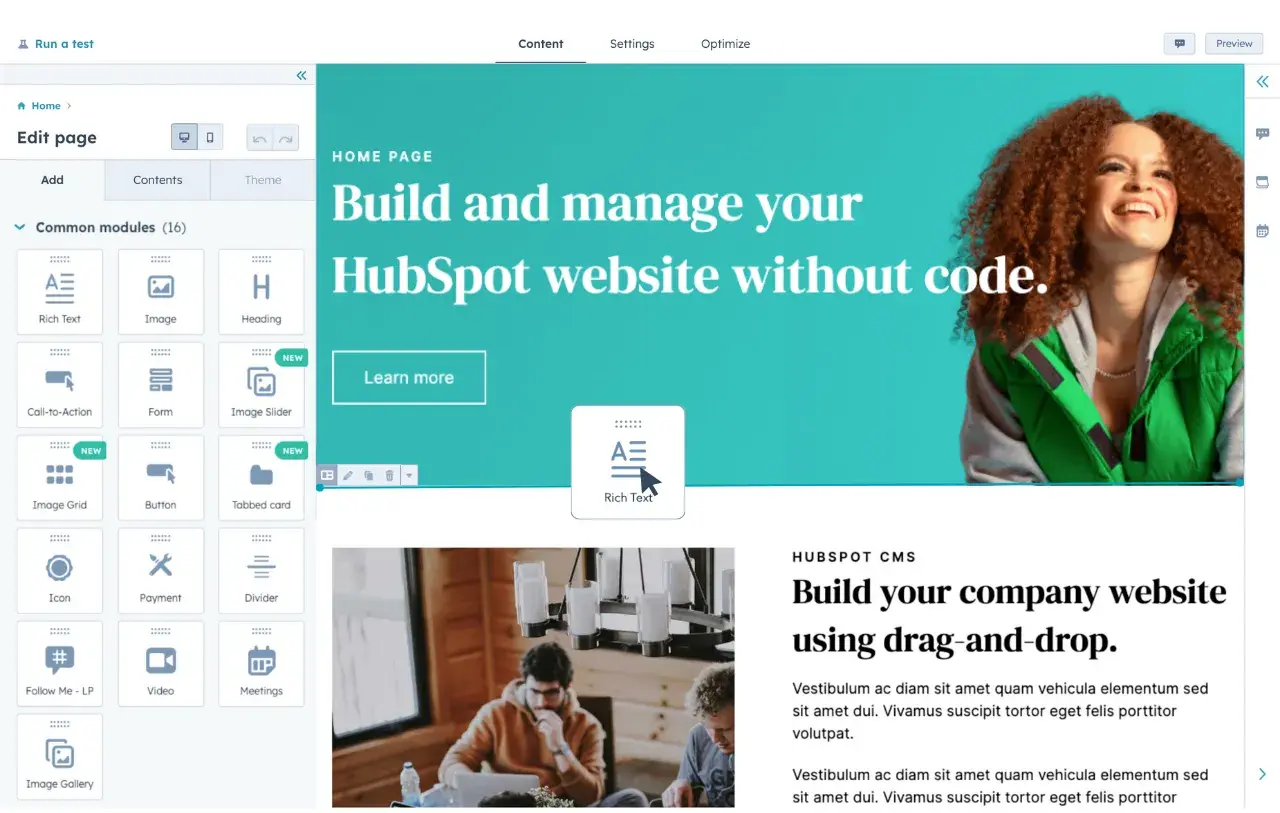
A good CMS tool for lead generation makes it easy to build, update, and optimize your site — without needing a developer for every little change. But what makes a good CMS? And more importantly, how do you know which CMS is right for you?
Here are a few features to look out for:
- Built-in lead capture tools. Your CMS should make it easy to add forms, pop-ups, and CTA buttons without jumping through hoops.
- Email marketing capabilities. Can you nurture leads right from your CMS? Look for built-in email tools and integrations to make your job easier.
- Live chat or chatbot integrations. Visitors have questions, and they want answers fast. A CMS with support can help convert them before they leave.
- SEO and analytics features. You need to know what’s working (and what’s not). A good CMS will help track traffic, conversions, and overall performance.
- Intuitive user experience (UX). If you’re not a designer or developer with website development experience, a CMS with easy-to-use templates and no-code customization will save you time and headaches. Trust me, I’ve been there.
I’ve tested my fair share of CMS tools, and some are definitely better than others. Make sure you choose one that aligns with your lead generation goals and simplifies optimization.
Pro tip: HubSpot’s free marketing and lead generation software is a great place to start — it covers forms, landing pages, email, and more right out of the box.
3. Build a landing page.
Once your lead generation website is up and running, the next big step is creating a landing page that actually converts.
Your landing page is where visitors either say “yes” to your offer — or leave. So, you want to make a great first impression, be clear about what you’re offering, and make it easy for them to say yes.

The good news is, you don’t need a complicated design or pages of copy to make a great landing page. I used to think that the more information I crammed onto a landing page, the better it would perform. But after running tests on multiple pages, I realized that the best landing pages do one thing really well: they educate.
Instead of overwhelming visitors with long paragraphs and too many choices, I started focusing on clarity. I made sure the headline answered the biggest question on their mind, the description was short and to the point, and the CTA made it obvious what to do next.
The key is keeping it simple and focused while making it easy for visitors to take action.
Here’s my go-to checklist for what every high-converting landing page needs:
- A compelling headline. Tell visitors exactly what they’re getting and why it matters — no fluff, just value.
- A short, persuasive description. Keep it clear and engaging. People don’t have time (or attention spans) for text-heavy explanations.
- Bullet points highlighting key benefits. Help visitors quickly scan and instantly understand why they should sign up.
- A strong CTA button. Your call-to-action should pop off the page and leave no doubt about the next step.
- An eye-catching product image or visual. Whether it’s a screenshot, mockup, or short video, visuals make your offer feel real.
The best landing pages feel effortless — they guide visitors naturally toward the next step without distractions. Less is more when it comes to design. Keep it clean, mobile-friendly, and straight to the point.
Next up, let’s talk about the key components of a successful lead generation website.
Components of a Lead Generation Website
A high-performing lead generation website isn’t just about throwing up a sign-up form and hoping for the best. It’s about creating an experience that guides visitors toward taking action in a way that feels natural — not forced.
Throughout my marketing career, I’ve seen that the best lead generation websites all share a few key components.
1. A value proposition that’s clear.
People don’t have time to dig through your website trying to figure out what you do. The second they land on your site, they should know exactly what you offer and why it matters. If your messaging is vague or confusing, visitors will bounce before you even have a chance to capture their info.
Pro tip: One of my favorite quick tests is to ask a friend who knows nothing about my business to read my homepage for five seconds. Then, I ask them to tell me what we do. If they hesitate or get it wrong, I know it’s time to simplify my messaging.
2. Landing pages that work.
I just broke down what makes a landing page successful — clear, concise, and distraction-free. But even the best landing page won’t do much if the rest of your website isn’t working to support it.
To turn visitors into leads, you need a website that’s built with conversion in mind at every touchpoint.
3. Forms that don’t make visitors work too hard.
Nobody likes filling out long forms. The best lead capture forms are short, mobile-friendly, and easy to find. Stick to the essentials — name, email, maybe one or two extra fields if necessary. The simpler it is, the higher your chances of getting that conversion.
I learned this firsthand when I was struggling to get more sign-ups on a landing page. We thought we were making it easy—just a few fields asking for name, email, company, job title, and phone number. But conversions were low. People were clicking away before they finished filling it out.
Then, we made one small change: we removed the phone number field. Almost overnight, the number of completed forms shot up. Turns out, our audience didn’t want to share their phone number unless they absolutely had to. I mean, would you?
4. CTAs that actually get clicked.
A basic “Learn More” button isn’t going to cut it. Your CTA should tell visitors exactly what they’re getting and why they should care. Instead of using language like “Submit“ or ”Learn More,” try something more specific like “Get My Free Guide” or “Start My Free Trial.”
Make it stand out, make it clear, and make it something they actually want to click.
Pro tip: If you’re unsure what CTA works best, A/B test it. Try a version with “Learn More” versus “Get My Free Guide” and see which drives more clicks. The data will speak for itself.
5. Proof that you’re the real deal.
People trust other people more than they trust brands. Case studies, testimonials, and reviews show visitors that others have had success with your product or service.
Even small things — like logos of companies you’ve worked with or security badges — can make a big difference. It’s called social proof for a reason. People want to know they’re making the right choice, and seeing others succeed gives them that confidence.
When these elements come together, your website stops being just a digital brochure and starts actually generating leads — without you having to constantly babysit it. Once it’s set up right, it keeps working for you 24/7, turning visitors into leads while you focus on everything else.
How to Increase Leads on Your Website
Now that I’ve covered all the key pieces of a great lead generation website, it’s time to take things up a notch and start pulling in even more leads.
Fortunately for all of us, you don’t need a full website overhaul to make a difference. Small optimizations can add up in a big way.
Here are nine simple (but powerful) tweaks you can make to start seeing results.
1. Add forms to high-traffic pages.
Some pages on your website are already pulling their weight — you just might not realize it. Instead of letting those visitors browse and bounce, why not turn your highest-traffic pages into lead magnets?
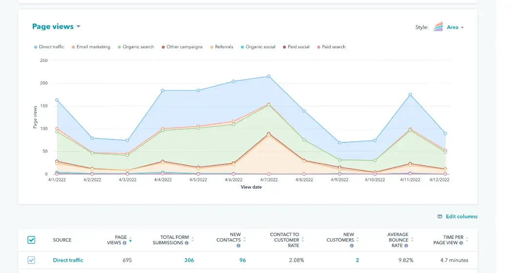
Start by taking a look at your analytics. Analytics tools can show you exactly which pages are driving the most traffic and where those visitors are coming from. Are they clicking through from an email campaign? Finding you through social media? Landing on a blog post from search?
Here are a few common traffic sources:
- Email marketing. Traffic from people who are already familiar with your brand — like subscribers clicking through from your newsletters or email campaigns.
- Social media. Visitors discovering your website from posts or ads on LinkedIn, Instagram, X (formerly Twitter), or any other social platform.
- Live chat. Visitors engaging with your team via live chat, often ready to ask specific questions or get quick support.
- Blog posts. Organic traffic coming from readers who find your high-performing blog content through search engines or referrals.
Once you know which pages people are landing on and where they’re coming from, don’t just leave them hanging. Make sure there’s something there to capture their interest — and their contact information.
If a blog post is racking up views, try adding a content offer like a downloadable guide or checklist. If your homepage is a top entry point, double-check that there’s a clear, compelling CTA guiding visitors to the next step.
Here’s a quick example: I once noticed that one of our blog posts — an industry trends roundup — was getting a steady stream of traffic from Google search. But visitors were reading it and bouncing without taking any action.
So, I added a downloadable trends report right in the middle of the post with a short form and a clear CTA. It was a small, easy change, but almost immediately, we saw more visitors converting. Turns out, meeting people where they already are (and offering something valuable to them) makes a huge difference.
2. Track and improve your lead generators.
Once you‘ve got your forms, CTAs, and landing pages in place, it’s easy to assume the job‘s done. But if you really want to keep your pipeline healthy, it’s worth digging into the data to see what’s working — and more importantly, what’s not.
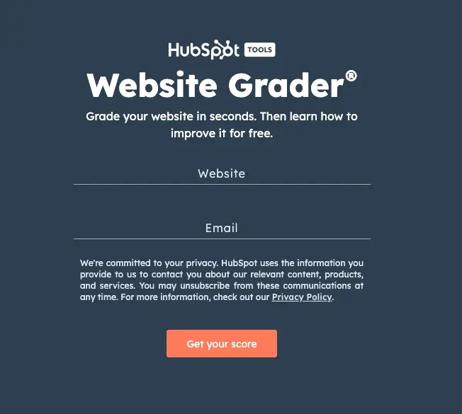
An easy place to start is by setting up regular check-ins to review your lead generation efforts. Try plugging your site into a tool like Website Grader to get an instant overview of how your pages, forms, and CTAs are performing — and where you can make improvements.
Analytics tools give you a clear snapshot of how visitors interact with your site — what they’re clicking on, where they’re dropping off, and which pages or CTAs are actually turning visits into leads.
Heatmaps can show you visually where people are engaging, while basic conversion metrics reveal which pages are doing their job and which ones might need some extra attention.
Let’s break it down with an example.
Say you have two landing pages: Landing Page A and Landing Page B. Both pages get the same amount of traffic — 1,000 visitors each. But only 10 people fill out the form on Landing Page A, while 50 people fill out the form on Landing Page B. That’s a big difference — 1% conversion rate versus 5%.
Why is one page performing better? It could be something simple, like the headline on Page B is clearer, the form has fewer required fields, or the CTA is more enticing.
The easiest way to figure it out is to look at each element side by side and ask yourself:
- Is one page easier to read?
- Does one form ask for less information?
- Is the CTA more specific or benefit-focused?
Once you spot the differences, test those changes on the lower-performing page and see if your conversions improve. I said it before and I’ll say it again: small tweaks = big results.
If you want to take it a step even further, set up A/B tests on key elements — like headlines, CTA copy, or form fields — to see what actually drives better results.
The best advice I can give you: Don’t be afraid to experiment! And don’t stop at just the landing pages either. Pull internal reports to check CTA clicks, form completions, thank you page shares, and even email engagement.
Once you know what’s performing best, double down. Build more content like it, adjust what isn’t working, and keep iterating. The answer’s in the data — you just have to listen to it.
3. Optimize each step of the lead generation process.
Having strong CTAs, great landing pages, and solid follow-up emails is a good start, but how well do they actually connect? If there’s even one disconnect or point of friction, potential leads will likely drop off before converting.
What’s worked best for me is zooming out and looking at the full journey, not just each individual piece.
Ask yourself:
- Is the next step always clear? After someone clicks a CTA, does the landing page reflect exactly what they expected? Is there a clear incentive to keep going?
- Are you reducing friction at every step? Maybe you’re asking for unnecessary info, or maybe the page isn’t optimized for mobile. Even a minor UX inconvenience can be enough to turn someone away.
- Are you following up strategically? Use behavioral triggers — send a follow-up if someone abandons a form, or offer a related resource based on what they just downloaded.
Personally, I like to sit down and literally map out the path my best-converting visitors take. Where did they click? How many steps did it take before they submitted a form? Once I have that, I look for any roadblocks — places where others might be hesitating or dropping off — and think about how I can smooth it out.
When you do notice certain areas that can be improved, try not to fix everything all at once. Instead, test small improvements at each step of the journey — and keep a close eye on the results.
Here are four key areas in the lead gen process to pay attention to.
CTAs
Experiment with CTA copy, color, and placement. Swap out “Learn More” for something more specific, choose a higher-contrast color, or move the CTA higher up on the page.
If you want to test something quick and easy, a tool like Canva can help you design different CTA buttons for free. Here are some helpful CTA examples to help you get started.
Landing Pages
Test headlines, form length, and visuals. Are you keeping things clean, focused, and mobile-friendly?
According to HubSpot’s State of Marketing Report, companies that prioritize optimizing their landing pages see a 12% higher conversion rate on average than those who don’t. Check out this landing page blog for some inspiration.
Thank You Pages
Don’t stop the conversation after form submission. Use your thank you page to offer an additional resource, discount, or next step. According to a Hubspot report, businesses that optimize their post-conversion experience see up to 15% higher retention rates.
Kickback Emails
These are automated thank you emails sent right after a visitor fills out a form on your site. Think of them as the friendly confirmation that delivers whatever was promised — whether that’s a downloadable guide, event registration, or free trial access. But they’re more than just a receipt. Done well, they keep the conversation going.
In fact, according to HubSpot’s 2025 State of Marketing Report, automated thank you emails like these continue to deliver some of the highest engagement rates, with an average 45% open rate and 16% click-through rate — well above standard marketing emails.
Just remember, the smoother and more connected the experience feels overall, the easier it is to keep people moving forward. When every step feels like a natural continuation of the last, you won’t lose as many leads along the way.
4. Start with a simple CTA on your homepage.
Your homepage is usually the front door to your website, so you want to make sure you’re not leaving visitors standing awkwardly at the threshold, wondering what to do next.
In my experience, a homepage isn’t the place to push a hard sell. Most visitors are still figuring out if they want to stick around. So the goal here is simple: give them one clear, low-effort next step to take.
Here are a couple of CTAs I’ve seen work well.
“Subscribe”
Think newsletter signups, product news, or a monthly round-up of helpful resources. Oftentimes, visitors aren’t ready to make a purchase when they first find your website, so this is a great commitment-free way to keep them in the loop.
After someone subscribes, you’ll also have the opportunity to personally follow up when it makes sense. A quick note, a relevant resource, or even asking about their challenges can help deepen the connection and turn that casual subscriber into a qualified lead over time.
“Try for Free”
Free trials and demos are a growing company’s bread and butter. They allow you to generate demand in your business and create a contact list of leads who are actively trying out your product. In other words, it’s a chance to give visitors real value upfront while giving yourself a clear path to nurture them toward becoming paying customers.
If you offer a free trial, demo, or consultation, make sure it’s front and center — no digging required. Keep the form short and sweet. Most of the time, a name and email are all you need to get started.
Personally, whenever I’ve tested CTAs like these, the lighter the ask, the better the results. People don’t want to hand over too much information right away — they want to test the waters first.
And if you’re not sure which CTA will resonate best, run a simple A/B test. As I mentioned before, try variations on the wording, placement, or even button color. See what gets the most clicks, and keep doing that.
The goal isn’t necessarily to lock down a sale immediately — it’s to give visitors a low-pressure way to stay connected so you can nurture them toward something bigger later on.
5. Add downloadable content offers to high-traffic blog posts.
One of the easiest ways to turn casual blog readers into leads is to offer them something extra when they’re already engaged.
I’ve seen this strategy work time and time again. Someone’s reading your blog post, nodding along, thinking “Yeah, this is helpful…” and then you offer them a free ebook, checklist, or guide that digs deeper on the same topic and offers even more value. They’ll be naturally inclined to opt in.
Here’s how to do it well:
- Start with SEO-driven blog content. Write blog posts around keywords and topics relevant to your industry. You want to attract readers who are already looking for answers.
- Identify your top-performing posts. Check which blog posts are getting the most traffic, whether it’s from search engines, social media, or email.
- Create a content offer. Whip up a related ebook, guide, template, or whitepaper that offers even more value on that same topic. Keep the barrier low — just ask for a name and email to download.
- Place the offer naturally. Add a short CTA within the blog post, maybe after the intro or halfway down the page. It should feel like a logical next step, not a pop-up interruption.
- Follow up. Once they download the content, send a follow-up email (That’s right, another kickback email!) that offers a related resource or next step. Keep the momentum going.
My advice? You don’t have to reinvent the wheel. Repurpose blog content you already have, bundle it together, and offer it as a downloadable guide.
In my experience, when you meet people where they are — reading your content — you’ll be surprised how willing they are to trade their contact info for a little extra value.
6. Add live chat to key pages.
Live chat tools aren’t just for customer support anymore—they’re a powerful (and often overlooked) way to generate leads. More and more buyers expect to be able to ask a question and get an instant answer, especially when they’re in research mode.
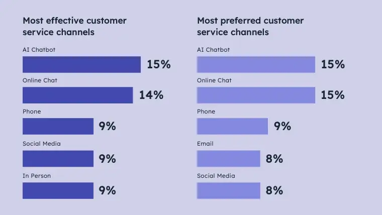
According to HubSpot’s 2024 State of Service report, AI chat and live chat are the two most popular service channels, highlighting just how important it is to offer real-time support when potential leads are exploring your site.
Here’s how I like to approach it:
- Start with high-intent pages. Add live chat to pages where visitors are most likely to have questions — like pricing, product details, or your demo sign-up page.
- Use chat to qualify leads in real time. You don’t need to pitch right away. Just answer questions, offer resources, and get a sense of what the visitor needs.
- Automate the basics. Set up a chatbot to handle FAQs or guide people to the right page. You can always step in manually for more complex questions.
Even something as simple as asking “What brought you here today?” can spark a conversation that turns into a qualified lead. The goal isn’t to be pushy — it’s to be helpful and responsive in the moment.
As an added bonus, you can even integrate your customer service team. So once it’s set up, your chat tool will work around the clock — collecting contact info, qualifying visitors, and helping people when they’re most engaged.
7. Personalize your CTAs.
Personalization has moved from “nice to have” to “must-have” — and for good reason. When something feels tailored to you, it instantly feels more relevant. That same logic applies to your website.
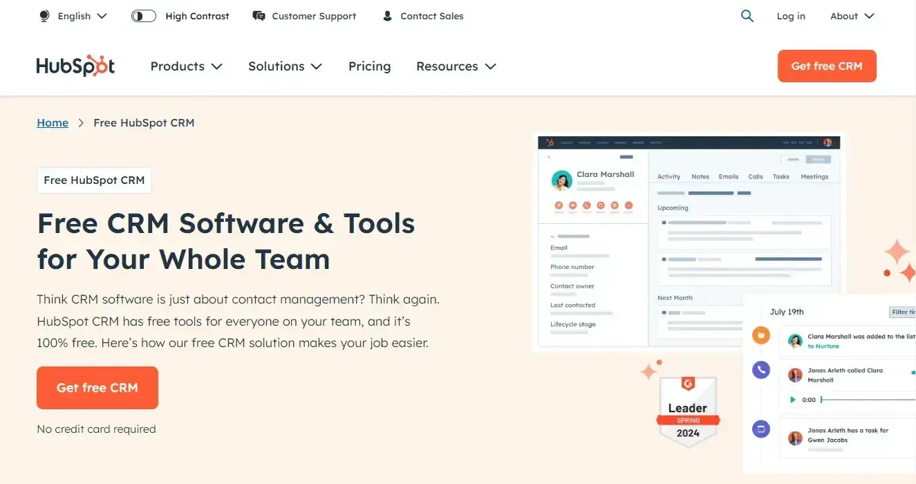
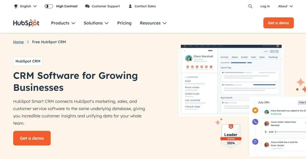
Smart content, or dynamic content, lets you show different CTAs, visuals, or even messages depending on who’s visiting your site. A new visitor might see a general free sign-up message, while someone returning for the third time might see a “Get a Demo” banner.
Here’s an example of how the same page might look to different users on HubSpot.
Default content for new user:
Smart content for returning user:
This isn’t just a nice UX touch — it actually works. Personalized calls-to-action perform 202% better than their generic counterparts, according to HubSpot data.
Let’s say a visitor recently read a few posts on email marketing. The next time they land on your homepage, your CTA could say: “Download Our Email Strategy Template.”
It’s helpful, timely, and shows you’re paying attention.
If you’re wondering how to set this up, you don’t need to start from scratch. Most CMS tools today (including Content Hub) offer smart content functionality. Just set the rules based on behavior, lifecycle stage, or source, and your site will do the rest.
It’s a small touch, but when someone feels like your site “gets them,” they’re more likely to stick around — and convert.
8. Test, test, test.
If there’s one thing I’ve learned the hard way, it’s that assumptions don’t always convert. What you think will perform well on your site might not resonate at all with your audience.
That’s where testing comes in.
A/B testing helps you take the guesswork out of your lead gen strategy. Instead of wondering whether a different CTA, form placement, or page layout would work better, you can just test it and find out.
One of the most surprising wins I’ve had came from something small like changing the wording on a CTA button.
Sometimes we assume bigger changes lead to bigger results, but often, it’s the smaller stuff — the headline, the button copy, the form layout — that makes the biggest impact.
Pro tip: I like to pick one thing at a time, run a test, and let the data decide. That way, you’re not changing everything at once — you’re slowly but surely improving the pieces that matter most.
While there are plenty of tools out there to help you A/B test, sometimes even just setting up two versions of a page and comparing the numbers is enough to make an informed decision. (This free ebook has fantastic tips for getting started with A/B testing.)
9. Nurture your leads.
No lead is going to magically convert into a customer overnight — if they did, you probably wouldn’t have read this far. Lead nurturing is how you keep the conversation going after someone’s shown interest.
Once a visitor fills out a form or downloads something from your site, make sure they’re added to a workflow that keeps them engaged. You want to deliver content that matches where they are in their journey — whether that’s product tips, a case study, or a “here’s what to expect next” kind of email.
I’ve found that the more relevant and useful the follow-up, the more likely people are to stick around. Don’t just blast the same generic newsletter to everyone — segment your leads and tailor your messaging.
Here’s an example of a lead nurturing email that offers the recipient some great content, guides them down the funnel, and gets to the point.
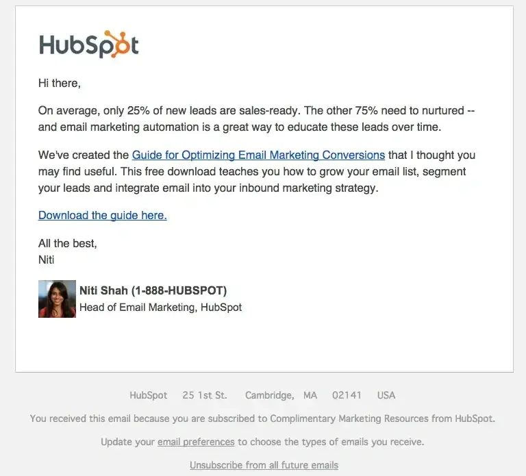
I remember once running a campaign offering a downloadable checklist. The landing page did well, and leads were rolling in — but the conversions kind of stalled there.
I didn’t have any follow-up in place beyond the initial “Thanks for downloading” email, so a week later, I sent a personal-feeling email that said, “Hey, curious if the checklist was helpful— here’s a short video that walks through it.”
The response rate was way higher than expected, and a few even replied asking for a demo. That’s when I realized how much a well-timed, genuinely useful follow-up can change the game.
So whether you’re using drip campaigns, retargeting, or just a well-timed check-in, remember this: people still want to hear from you after they’ve converted — especially if you’re offering something that actually helps them take the next step.
The more value you offer in your nurture flow, the more likely they are to become a customer when the time is right.
Go Forth and Capture Leads
If there‘s one thing I hope you take away from all of this, it’s that small changes really can make a big impact. You don’t need a massive redesign or a brand-new strategy to generate more leads — you just need to keep showing up, testing, and optimizing as you go.
I’ve seen firsthand how tiny tweaks to a form, a better follow-up email, or a more thoughtful CTA can completely change the way visitors interact with your site. Remember, once you put these things in place, they don’t just work once — they keep working.
So whether you’re starting from scratch or just looking to improve what you’ve already built, the opportunity is right in front of you.
Go on — make that first update. Launch the experiment. Send the follow-up email.
Your next best lead might be one click away.
Editor’s note: This post was originally written in April 2015 and has been updated for comprehensiveness.
![]()

![Free Resource: Website Optimization Checklist [Download Now]](https://no-cache.hubspot.com/cta/default/53/00d9cc96-eff7-4cea-8ff3-583374c3dcd5.png)


![PowerPoint Tips to Present Like a Pro [Expert Advice & Free Templates]](https://firstonlineprofits.com/wp-content/uploads/2025/02/2d0b5298-2daa-4812-b2d4-fa65cd354a8e-440x58.png)


Last Comments